Harnessing expertise from D2C and ecomm brands to sculpt a visually compelling, modern, and purpose-driven identity, igniting a powerful brand halo effect for a parent company.
Logo Design, Brand Identity, Web Design
The background
Launched in February 2022 by Stagwell Inc. a global marketing and comms group, Stagwell Marketing Cloud (SMC) was created with the goal of providing in-house marketers with transformative SaaS and DaaS tools. Since then, SMC has developed and incubated products including ARound (in-person AR experiences for sporting events) and PRophet (identifies media targets and creates pitches with AI and machine learning).
The challenge
The modus operandi seemed straightforward: use the same core colors as Stagwell, utilize Stagwell typefaces, with the goal of making sure the SMC branding felt like an extension of the parent company. SMC also needed a design system that was flexible to their growing product categories, so I did research on similar company’s approaches to sub brands. We decided that SMC’s design system for sub brands should be aligned with HubSpot’s execution below:
The opportunity
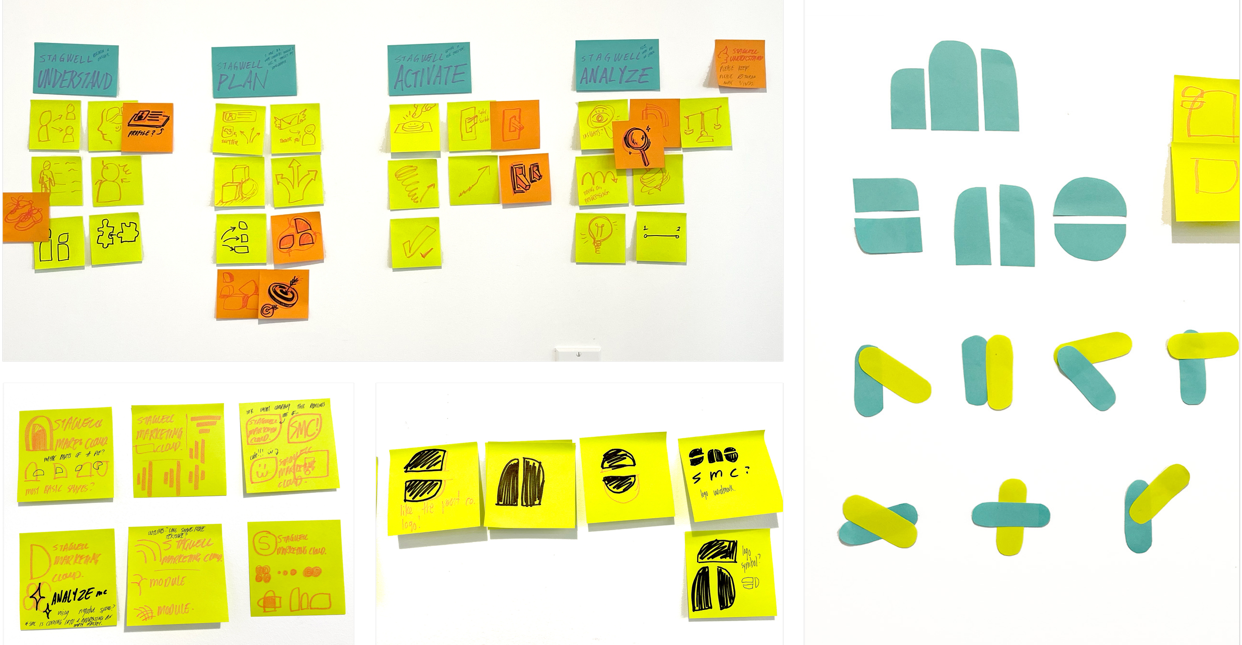
The phrase “building the plane while flying it” best describes the marketing team’s workflow. While actively meeting with SMC product teams to understand their roles, I was in the middle of designing the SMC and product categories. I began the ideation process with post-it notes, at times cutting them into shapes and experimenting with overlapping silhouettes. My early concepts oscillated from “standard corporate fare” to “illustrative and bold” where no idea was too precious to experiment with.
The issues
We ultimately decided on the logo approach with the three vertical columns resembling a cloud. While it echoed our parent company’s logo, it also friendly and original. But this v1 had some problems, namely with how it closely resembled someone holding up a middle finger.
To resolve this, I made the column widths consistent and reduced the roundness of the corner shapes. This deemphasized the offending middle column and helped to make the logo mark feel as one unit.
The vision
As one of the big projects I worked on right after creating the branding, I built Stagwell Marketing Cloud’s website using Webflow. I created isometric illustrations and worked on the interaction, copy, and strategy alongside the CCO and content editor.