While working at Dame Products, I had the pleasure to work on editorial and spot illustrations for their website and wellness blog, The Horizontal, and establish their first Illustration Style Guide.
Dame’s Mission Statement:
“Dame Products was founded by smart women to make phenomenal toys for sex. [Their] continuing mission: to design well-engineered products, to heighten intimacy, and to improve the sexual experiences of humankind.” -Dame Products Press Kit
Through conversations with the Creative Director, I got a sense of what brand goals they had for their illustrations:
Playful
Body-Centric
Inclusive
While previous editorial illustrations on The Horizontal were exciting and depicted bodies in dynamic positions, they were often trans-exclusionary (depicting normative gender presentations and explicitly), largely depicted normative cisgender bodies in heterosexual pairings, and sometimes represented people of color with non-realistic skin tones (see: Meg Robichaud’s article, “You Can’t Draw Purple People and Call it Diversity”)


My initial executions:

For “December sexoscopes”

For “Sex and SSRIs”

For “Vibrators and Arousal”
❌
What didn’t work:
Too much negative space in background.
Use of black outlines feels cartoonish.
✔️
What did work:
Darker skin tones are represented with REALISTIC colors.
Individuality & expressiveness in figures.
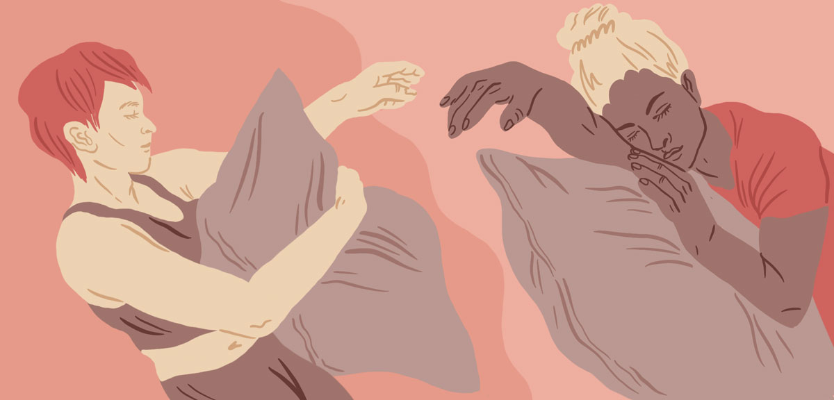
Final executions:

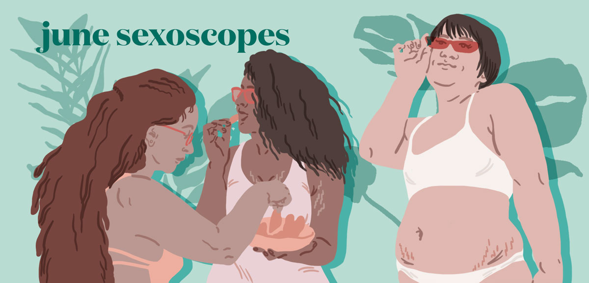
For “March sexoscopes”

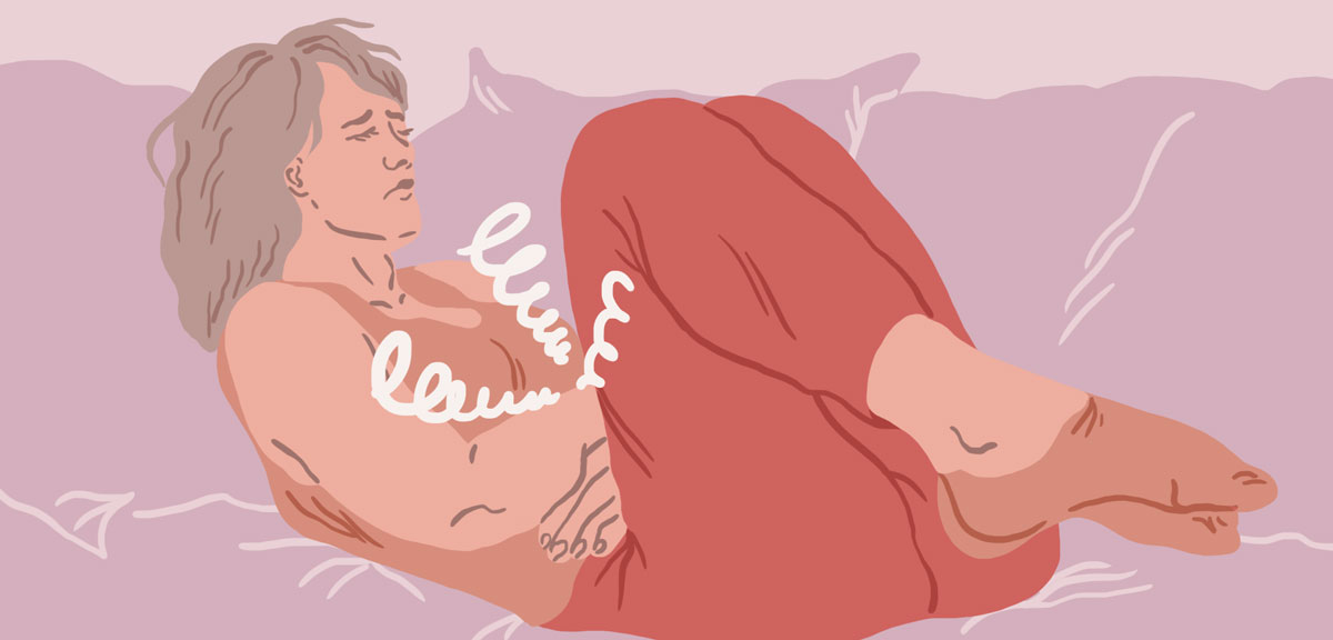
For “Sleeping Apart”

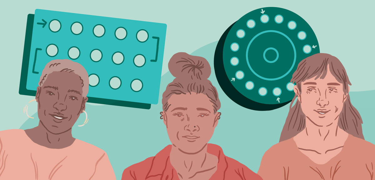
For “Different Kinds of Birth Control”
✔️
What did work:
Dynamic postures add expression and personality to figures.
Drop shadows and background patterns playfully utilize space.
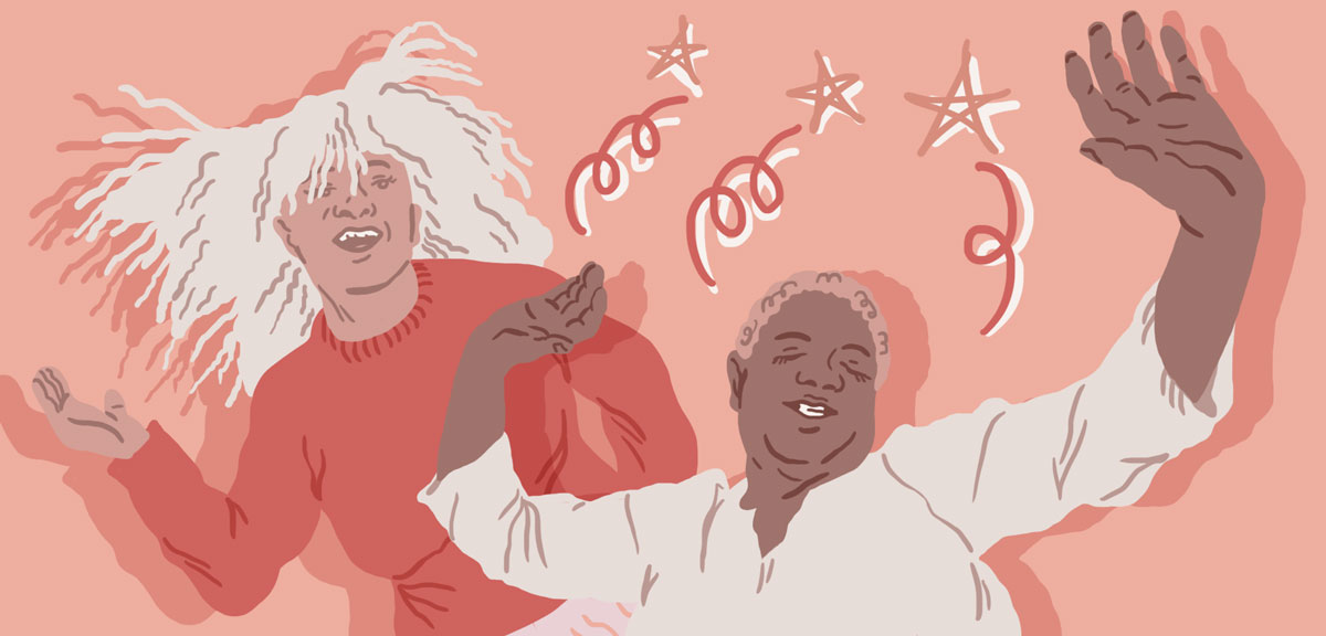
Some of my favorite editorial illustrations: